- Measuring Growth
- Public Reports
- Restricted Reports
- Roster Verification (RV)
- Getting Started
- Specifying Instructional Responsibility
- All Actions by Role
- All Actions for Teachers
- All Actions for School Administrators or Roster Approvers
- Manage teachers' access to RV
- Assign other school users the Roster Approver permission
- View a teacher's rosters
- Take control of a teacher's rosters
- Add and remove rosters for a teacher
- Copy a roster
- Apply a percentage of instructional time to every student on a roster
- Batch print overclaimed and underclaimed students
- Remove students from a roster
- Add a student to a roster
- Return a teacher's rosters to the teacher
- Approve a teacher's rosters
- Submit your school's rosters to the district
- All Actions for district admin or district roster approvers
- Assign other district users the Roster Approver permission
- Take control of a school's rosters
- View a teacher's rosters
- View the history of a teacher's rosters
- Edit a teacher's rosters
- Add and remove rosters for a teacher
- Copy a roster
- Apply a percentage of instructional time to every student on a roster
- Batch print overclaimed and underclaimed students
- Return a school's rosters to the school
- Approve rosters that you have verified
- Submit your district's rosters
- Understanding the RV Pages
- Viewing the History of Actions on Rosters
- Additional Resources
- General Help
District Diagnostic | 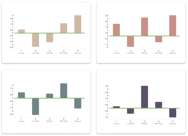 |
Interpreting the Data
The Bar Chart
The purpose of the District Diagnostic reports is to help the district assess the growth of students at different achievement levels. These reports can help teachers and admins set priorities for improving the instructional program to meet the needs of students at all achievement levels.
To compare growth across groups, it can be helpful to focus on the chart first.
In this chart, the green line represents expected growth. The blue bars represent the growth of students in the most recent year. On the and reports, if you have data from previous years, you'll also see gold bars on the chart. The gold bars represent the growth of students for this district in the same subject and grade or course for up to three previous years. In other words, the blue bars represent the cohort of students from the most recent year, while the gold bars represent previous years' cohorts.
Each bar has solid and dotted black whiskers. The solid whiskers mark one standard error above and below the growth measure, and the dotted whiskers mark two standard errors above and below the growth measure. It's important to consider the standard error as you interpret the growth measures represented by the bars on the chart. Consider the overall pattern of the bars rather than focusing on any individual value. However, it can be helpful to keep these guidelines in mind.
| A bar that is at least one standard error above the line suggests that the group's average achievement level increased. If the bar is at least two standard errors above the line, the evidence of growth is even stronger. | 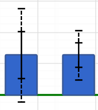 |
| Likewise, if the bar is at least one standard error below the green line, the group likely lost ground academically, on average. If the bar is at least two standard errors below the line, the evidence is stronger. | 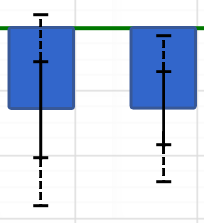 |
| Regardless of whether the bar is above or below the green line, if it is within one standard error of the line, the evidence suggests the group's average achievement did not increase or decrease. | 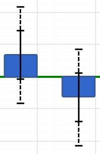 |
The Pie Chart
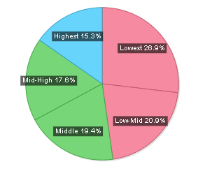
The slices of the chart are color-coded to indicate whether the group's average achievement level increased, decreased, or remained about the same compared to expected growth.
Diagnostic Color | Growth Measure Compared to Expected Growth | Interpretation |
|---|---|---|
Light Blue | At least one standard error above | Moderate but not significant evidence that the students made more growth than expected. |
Light Green | Between one standard error above and one standard error below | Evidence that the students made growth as expected. |
Light Red | More than one standard error below | Moderate but not significant evidence that the students made less growth than expected. |
White | N/A | Not enough students to generate a growth measure. |
As you reflect on these reports, you might want to ask yourself these questions:
- Did each group make enough growth to at least meet expected growth?
- Is there a difference in the amount of growth the groups made?
- If there is a difference in the amount of growth across groups, what factors might have contributed to the differences?
For Diagnostic and Performance Diagnostic reports:
- Is the overall pattern of growth consistent across grades for the same subject?
- Is the overall pattern of growth consistent across subjects in the same grade?
- Is the overall pattern of growth consistent across courses?
- How does the pattern of growth for demographic subgsets compare to the pattern for all students?
- How can this information inform course placement, instructional practices, strategies, and academic programs?